
Colour is becoming easier to use at the wrist because it occupies a controlled area. A red coat or purple bag asks for commitment, while a burgundy, blue or green strap adds colour without dictating the rest of the outfit. For women wearing classic watches, that small change can make a familiar case feel relevant to different clothes and occasions.
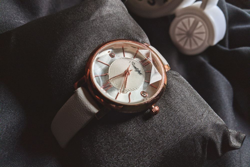
Begin With the Colours Already on the Watch
The dial is the best reference point. Blue hands, coloured hour markers, a warm cream surface or a mother-of-pearl effect may suggest shades that are easy to repeat or contrast. The case metal matters as well. Steel and white metal tones are flexible, while yellow and rose-gold colours often sit naturally with warmer browns, reds and greens.
There is no rule that a strap must match the dial. A white face gives room for colour, and a black dial can create a sharp contrast. The aim is to make the watch look deliberate. If the case is decorated or the dial already contains several colours, a quieter strap may prevent the finished combination becoming busy.
Use the strap as an accessory rather than a uniform
Colour works best when it relates to the clothes without copying every detail. A navy strap can sit beside grey tailoring, denim or a cream jumper. Burgundy works with charcoal, camel and dark green. Red can provide a small point of contrast against black. Turquoise or purple can be kept for weekends and events when a stronger detail feels appropriate.
The Watch Obsession collection of Ladies watch straps includes classic shades as well as blue, green, burgundy, red, pink, purple and turquoise. Because the range covers different widths and finishes, colour can be considered after the practical requirements of the watch have been established.
Texture changes the strength of a colour
The same shade looks different on smooth, grained and embossed leather. Smooth leather gives clear, even colour and tends to look cleaner. Grain breaks up the surface and can make a strong shade feel more relaxed. Crocodile or alligator-embossed patterns create light and shadow, which may deepen darker colours.
Stitching also controls how much attention the strap receives. Tonal thread keeps the colour block simple. White or contrasting stitches make the outline more obvious and often push the design towards a sportier look. A narrow watch may need finer details than a large casual model.
Finish should suit how the watch is worn. A glossy surface can work for evenings and formal events, but it may feel overdressed with casual clothing. Matt and lightly textured options are easier to use through an ordinary working week. The buckle finish should connect with the case where possible, particularly on small watches where the hardware remains visible.
Build colour around real occasions
A practical way to move beyond neutrals is to assign straps to situations. Keep one dark option for formal work or events. Choose a richer colour for normal days and a lighter or brighter version for weekends. This creates variety without buying colours that look appealing online but have no role in the wardrobe.
September is a good point to review those roles. Summer whites and pale shades may give way to navy, burgundy, forest green or cognac as jackets and knitwear return. There is no need to follow a seasonal palette exactly. The useful question is which colours appear repeatedly in the clothes that will actually be worn over the next few months.
Quick-release spring bars make a small rotation easier on compatible watches. A strap can be changed before work or an event without using a separate tool. Standard spring bars remain suitable, but owners should use the correct tool and confirm that each end is seated properly before wearing the watch.
Fit must come before colour
An attractive shade cannot compensate for the wrong size. Measure the space between the inside edges of the lugs in millimetres. Do not measure further down an old, tapered strap. Then check the total length, the length of each side and the width at the buckle if an original clasp will be reused.
Smaller cases can be sensitive to proportion. Heavy padding, thick stitching or a large-scale pattern may overwhelm the watch. A flatter strap with a gentle taper often keeps the focus on the dial while still allowing the colour to be seen. A larger everyday watch can usually carry stronger texture.
Materials also need to suit use. The ladies’ collection focuses heavily on leather, including calfskin, buffalo, alligator, crocodile, lizard and embossed options. Each has its own care requirements. Leather should generally be protected from prolonged moisture and allowed to dry naturally if it becomes damp, with the specific manufacturer’s guidance taking priority.
A classic watch does not have to look fixed
Changing colour does not alter the part of the watch that carries its identity. The case, dial and movement remain the same. This makes the strap a low-commitment way to test a shade that might feel too strong in a larger accessory.
Neutral straps will continue to be useful, but they no longer need to be the only serious option. A measured choice of colour can connect a classic watch to modern clothing, give an older piece more wrist time and make the person wearing it feel that the watch belongs to her rather than to a fixed styling rule.