Alpine Tracht has been combining bold colors intentionally for centuries. The dirndl alone requires three separate color decisions for each of its components, the bodice, the skirt, and the apron. The color palette is chosen carefully for every piece to make the final outfit balanced and aesthetically pleasing, while each piece carries its own tone. This color-combining technique is deeply rooted in Alpine traditional outfits, and it predates modern color theory.
Why Alpine Dress Has Always Taken Color Seriously?
Alpine dressing is heavily influenced by the surroundings. The colors of natural landscapes, blue skies, and the animals are part of Alpine dressing. It is a way of portraying regional connection and identity.
Color Was Identity, Not Decoration
In the Alpine regions of Bavaria, Austria, and Tyrol, color was never arbitrary. Villages developed specific palettes to distinguish themselves from neighboring communities. The color combination you wore told people where you were from before you opened your mouth.
Villages deep in the mountains and valleys had specific colors to indicate their community and set them apart from others. This color coding was a visual language for social and geographic identity in a landscape where different valleys rarely overlapped.
The Color combinations Came From the Landscape
Earth tones like brown and green are the most prominent colors. They are a reflection of the Bavarian connection to nature. The Bavarian locals take pride in their agricultural resources and natural landscapes. And these resources were celebrated through their arts and culture.
The color palette of Bavaria was taken directly from what surrounded the people wearing it. Forest green from the pine slopes. Warm brown from the earth and leather. Bavarian blue from the flag and the Alpine sky. Deep red from feast day celebrations.
Embroidery Thread Colors Carried Meaning Too
Green thread stands for the forests, red for feast days, and blue for local loyalty. The colors carry meanings that predate anyone alive to explain them.
This layering of meaning across every element of the outfit is what makes Alpine Tracht a masterclass in intentional dressing. Nothing is chosen at random.
How Does the Dirndl Color System Work?
Dirndls are the Bavarian traditional outfit that carries the color dressing skill. They are built on the concept of combining colors as a dressing style.
The Three-Piece Color Relationship of Dirndls
The most significant styling statement of dirndls is their color combinations. A Bavarian dirndl dress is built from three independent color decisions. The skirt, bodice, and apron each have their own colors and fabrics. Getting the relationship between them right is the core of dirndl color dressing.
Although patterns and prints are mixed freely, colors and textures are well considered in fabric selections. The apron really brings the ensemble together.
The traditional approach uses the apron as the anchor. Pick the apron fabric first, read the colors in it, then build the bodice and skirt from those tones.
The Dirndl Apron is the Key Decision
Many times, a color in the skirt or bodice will be pulled out and highlighted in the apron textile. Or the apron fabric is selected first, then the dirndl bodice and skirt fabric are selected from the colors in the apron.
This is a practical principle that transfers directly into modern outfit building. Start with the most patterned or complex piece. Pull the supporting colors from it. The outfit holds together because everything shares a tonal source.
Color Contrast Is the Traditional Default
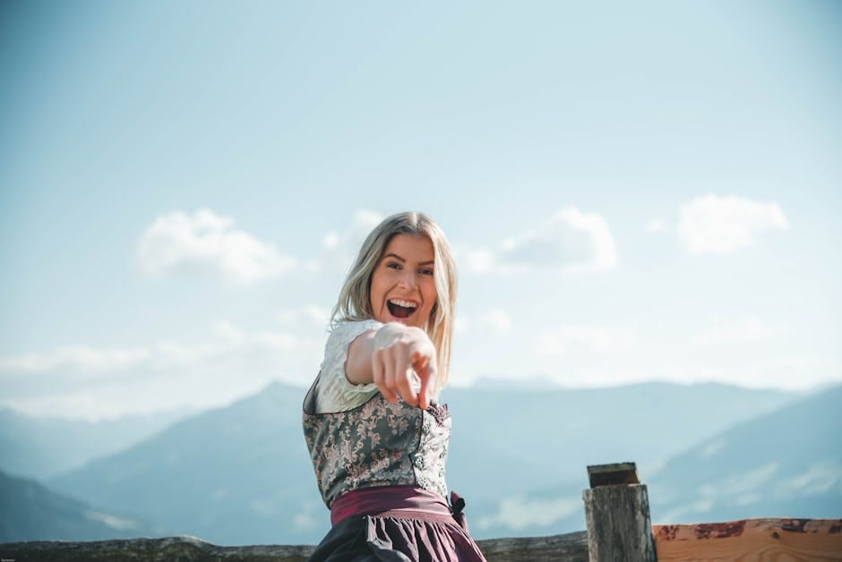
Color contrasting is the traditional styling staple of Bavaria. Color contrasting is the principle in dirndl styling, too. The apron must contrast with the skirt and bodice. The perfect color contrast occurs when the dirndl outfit consists of a light-colored bodice with a dark skirt. accompanied by a light colored, puffed sleeved blouse and an edelweiss-patterned apron.
Contrasting in Each Element of Dirndls
Light against dark colors. Printed apron over plain skirt. Silk apron over a wool bodice. The contrast is deliberate, and it is what gives the outfit its visual structure. Matching everything to a single color reads as flat and loses the layered character that makes the traditional combination work.
What Each Color Signals in Alpine Tradition?
Each color in Alpine dressing has its own significance. The most prominent colors that appear in Alpine traditional clothes are green, blue, and brown.
Green: The Color of Growth and Fertility
In Alpine culture, green is the color of growth and abundance. Green symbolizes nature and it is very positively associated with it. Green is often paired with browns for an earthy color combination and lighter colors to achieve the contrasting theme.
Green with cream or ivory embroidery is the most traditionally appropriate combination. It photographs well in natural settings and reads as Alpine rather than generically festive.
Red: The Color of Celebrations
Red is the color of fiestiness and energy. In Bavarian traditions, red outfits were worn at the cultural celebrations.
Red is also the feast day color in Alpine embroidery tradition. A ruby red dirndl with a black apron is one of the sharpest and most photogenic combinations in the entire range.
Blue: The Color of Loyalty and Fidelity
Blue is said to signal loyalty. Blue is used to portray the sense of belonging to the homeland. The color blue reminds the clear blue skies over Munich. Navy or sapphire with a white apron is the most regionally correct blue combination.
Popular Bavarian tracht brands like Dirndl Delights and Lederhosen Store carry the dirndl color pairing in several lengths and fabrics, from mini length cotton for summer events to long length velvet for formal occasions.
The Alpine Pairing Rules that Transfer into Everyday Dressing
There are a alot of inspiring principles that can be adopted from Alpine traditional dress. These dress codes date back 100 years and persist because of their timelessness. The modern styling can learn from them
Contrast Tones, Not Matching Tones
The dirndl’s three-piece color system demonstrates something modern dressing often forgets: contrast creates visual interest that matching tones cannot. Monochromatic outfits are good but they fall flat.
Take the traditional emerald skirt and crimson apron pairing. Pairing an emerald green skirt with a scarlet or crimson red apron is the complementary choice.
Color Contrasting Within the Same Color Family
Color contrast, keeping the same warm or neutral tones, nails the technique. The same principle applies to everyday outfits. Earth tones mix naturally because they share a warm base. Jewel tones mix because they share cool saturation. Problems arise when warm and cool tones are combined without a bridging neutral, like a white blouse or cream apron.
Use the Apron Principle
In Alpine dressing, the apron anchors the whole outfit. In modern dressing, that anchor is usually a bag, a belt, or a scarf. Choose your most patterned or complex piece first. Then build the rest of the outfit by pulling colors from it.
This is not a new technique. It is what Bavarian women have been doing with their apron fabrics for three centuries.
Let One Piece of Clothing Be Plain
A nice wool or cotton dirndl can have added spice with a silk apron. If you are afraid of color in the dirndl dress, make your apron shine.
The same logic works in any outfit. If the skirt is printed, keep the top plain. If the jacket carries a bold tone, keep the trousers neutral. One complex piece paired with two quiet ones is the formula behind most well-executed Alpine Tracht combinations, and it transfers directly into everyday dressing without any adaptation.
What Modern Fashion Can Actually Learn From Alpine Color Dressing?
Alpine Tracht does one thing that modern fashion rarely manages: every color decision connects to something real. The green comes from the forest. The red comes from feast days. The brown comes from the earth and the leather. The blue comes from the sky and the flag.
Sense of Belonging even in Dressing
That connection of Alpine dressing to their roots is what makes the combinations hold up across centuries without looking dated. They were never trend-dependent to begin with.
Modern fashion followers who want to build a more intentional wardrobe could do no better than to start here. Pick a palette with a source. Choose contrast over matching. Use one complex piece as the anchor and build everything else around it. Let seasonal conditions influence the color weight you reach for.
Conclusion
Traditional clothing color styling rules are not specific to Alpine dress. They are how every coherent regional dress tradition has worked, everywhere. Alpine Tracht just happens to apply them with particular clarity and consistency, and has done so long enough for the results to be hard to argue with.