Listen: There are a lot of fashion brands online, and that number’s going to keep growing. So much so that the global fashion ecommerce market size is expected to grow at a compound annual growth rate of 13.2% from 2025 to 2032.
Now, attention becomes a priority here because you have more banners, storefronts, and feeds from different brands in consumers’ faces. So, you need to grab attention and build credibility with the right color, layout, and imagery.
So, in this guide, you’ll see 8 practical tips for visual branding for fashion brands. These will help your brand look intentional and distinctive. And you can apply them to your website, social platforms, campaigns, and content.
Let’s get started!
1. Build Your Visual Identity Around a Single Brand Idea
You need to start with a single idea when it comes to visual branding for fashion brands. So, pick a central visual concept to guide your design decisions.
More so, your brand should communicate that idea instantly. So, you can go for minimal and elevated, bold and expressive, or clean and functional. But the main thing is that this idea should show up wherever your brand does.
Let’s say your idea is minimalistic. You can limit your color palette to two or three muted tones. Then, use enough white space across your website and pick a clean typography. And you should avoid busy prints, cluttered layouts, or mixed visual styles.
But, before approving any visual asset, make sure it reinforces your core idea. This consistency helps build your credibility.
| Use a single, well-defined brand idea to keep your visual identity focused, recognizable, and consistent across every channel. |
2. Choose a Color Palette That Signals Your Price Point
With visual branding for fashion brands, your color palette should tell customers how much your brand costs. This way, you can attract the right audience.
So, start by defining the pricing point you want to signal. If it’s premium, you can use soft colors, low contrast, or tonal palettes. Or, if it’s luxury, you can go for neutrals, blacks, off-whites, or muted earth tones, like this:
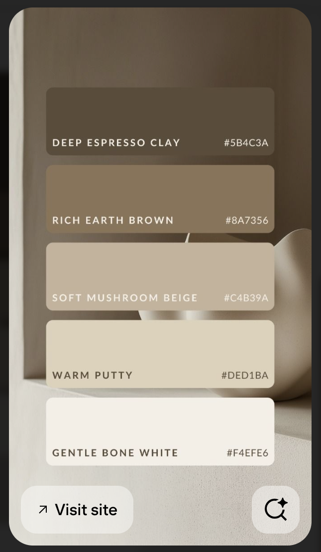
Image via Pinterest
The important thing here is to limit your main palette to one primary color, one secondary color, and one neutral. You can use everything else as an accent.
Once you have this palette, ensure you apply the colors consistently. You can use:
- Primary colors for key CTAs, highlights, and hero sections
- Neutral backgrounds for product pages and lookbooks
- Accent colors for drops, promotions, or seasonal edits
| Using a tight, intentional color palette helps visual branding for fashion brands signal quality, mood, and positioning at a glance. |
3. Use Typography as Your Brand Signature
Your typography is one of the fastest ways customers recognize your brand without a logo. So, use it as your signature.
You can choose one primary font for your headlines and one supporting font for body text. But, try not to use more than two families.
One more thing: You should match your font to your brand intent. So, say you’re a luxury brand, you can use sharp serifs. But, if you’re a lifestyle brand, you can go for clean sans-serif.
While you’re selecting your typography, you should also have rules for using it. For instance, you might want the same bold headline font across your banners, emails, and Instagram.
So, specify your headline sizes and weights, line spacing, and alignment. You should also choose where bold or uppercase is allowed.
| Using consistent typography helps you build recognition and gives your fashion brand a visual voice for customers. |
4. Create a Repeatable Photography Style
Photography is another important thing to prioritize with visual branding for fashion brands. So, create a repeatable system you and your team can follow, even if you use AI-generated images.
You can define clear rules for your lighting style, whether it’s natural, studio, high contrast, or soft. Plus, you can specify if you want close-ups, cropped, or full-body for your camera angle. This way, your images accurately represent the high-quality clothes you sell.
On top of that, pick your background, whether it’s textured, lifestyle, or plain. And work with your team to choose your models’ expressions and poses.
For instance, if you’re a lifestyle brand, you can use natural window light, neutral backdrops, and relaxed poses in your shoot. This way, your product pages, campaigns, and social media posts are visually aligned.
While you’re doing this, document these rules and share them with your photographers and creators. This way, each shoot looks consistent with your branding.
| Have a defined photography system to ensure your visuals stay cohesive, recognizable, and professional. |
5. Use Mobile-Friendly Designs
Global mobile in-app purchase revenue reached $167 billion in 2025. So, you see?! Consumers are buying on their mobile devices more than ever.
That’s why, with visual branding for fashion brands, you need to design with mobile-first in mind. So, crop your images for vertical formats and keep focal points centered. And use large, easily readable text to avoid details disappearing on small screens.
For instance, your campaign banners should work in both Instagram Stories and desktop headers. But, test your visuals at thumbnail size before publishing.
More so, if you’re scaling, you’ll benefit from time savings by using a banner creator to resize your assets for various screen sizes. This way, you don’t have to rebuild them from scratch. Plus, you have access to templates for assets like this:
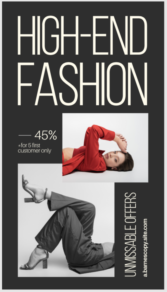
Image via Adobe Express
| Make your visuals mobile-optimized to help your fashion branch grab customers’ attention where they make buying decisions. |
6. Make Your Instagram Grid a Visual Lookbook
You can make your Instagram grid read like a well-curated lookbook. So, let every post support an overall visual style if you use Instagram for business.
For instance, you can plan posts in sets and alternate product shots, lifestyle images, and detailed close-ups. But, ensure you maintain consistent lighting and color temperature. Then, repeat similar compositions every 6 – 9 posts, like this:
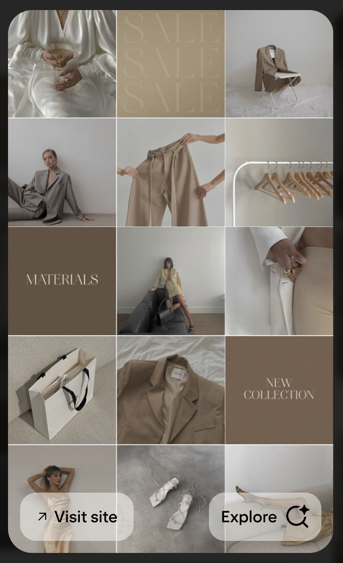
Image via Pinterest
Remember: You should preview your grid before posting. If a post doesn’t fit the flow, don’t publish it.
| Use a planned Instagram grid to turn your social media content into a cohesive visual asset that reinforces your brand identity. |
7. Use Visual Templates
You can use visual templates to stay consistent as your brand grows and needs more assets. So, create reusable templates for your promotional banners, product launches, Instagram stories and posts, and email headers.
Each of these templates should have your specific brand fonts, colors, spacing, and logo placement. This way, if you have a team or hire a personal assistant to handle your visuals, they can create assets without breaking any brand rules.
| You can use visual templates to maintain brand consistency and produce content faster. |
8. Curate User-Generated Content
You can use user-generated content to build trust with your audience. But it has to fit your visual standards, so don’t repost everything.
That’s why you should set clear rules for this type of content. Specify the lighting and color style you prefer, and mention avoiding a cluttered background or poor image quality. This helps you maintain your visual identity.
| You can curate user-generated content to build credibility and still maintain your visual identity. |
FAQs
1. How do I start a visual brand for a new fashion and lifestyle brand?
First, define your core brand idea and a mood board that shows your target aesthetic. Then, pick a consistent color palette and two signature fonts that you’ll use across all platforms.
2. How often should a fashion and lifestyle brand refresh its visuals?
You can audit your brand quarterly, but for a full visual review, you can wait a couple of years. This way, you don’t confuse your existing customer base.
3. What are the most important visual elements for fashion and lifestyle brands?
You can prioritize high-quality photography, a cohesive color palette, and solid typography. This helps you with credibility, and consumers can recognize your brand.
Conclusion
The truth is: Visual branding for fashion brands isn’t about looking trendy. You need to be instantly recognizable.
So, define your core brand idea, standardize your photography, and audit your visual assets regularly. This way, your brand is consistent and feels premium.