
Want your semi-permanent tattoo to pass the “is it real?” test—on camera and IRL? It’s not just the design. Light, surface prep, and framing can transform good ink into believable ink. Use these photo-first tricks to make your designs look freshly done by a pro.
1) Light like a portrait, not a product
Skip harsh flash. Shoot in soft, directional light—window light or golden hour. Position the tattoo so the light rakes across it from 30–45°; that side-light adds gentle micro-contrast that makes linework read like ink in skin. If midday sun is your only option, diffuse it with a sheer curtain, T-shirt, or a translucent shopping bag. Bounce light back with a white notebook to lift shadows without flattening details.
2) Matte the skin, not the lines
Gloss equals “sticker.” After the tattoo fully develops, dab the surrounding skin with the tiniest bit of translucent powder or oil-blotting paper, avoiding the design itself. This kills lens flare and keeps edges crisp. Pat dry after showers; never rub. Remove stray fuzz with a lint roller—micro-fibers can catch light and give away the illusion.
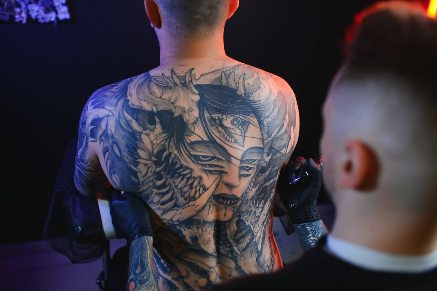
3) Follow the body’s architecture
Great placements ride bone lines. Angle the camera so the tattoo aligns with a natural landmark—collarbone ridge, wrist bone, or deltoid curve. For forearm pieces, rotate slightly so the artwork faces the lens without twisting the skin. On shoulders and ribs, a three-quarter turn creates depth that photographs like healed ink.

4) Frame for scale (so it looks “meant to be”)
Include a familiar object in frame—watch, ring, neckline, or shirt seam—to anchor size. Use the rule of thirds: place the tattoo near an intersection point and leave negative space ahead of the body’s facing direction. This composition makes designs feel intentional, not accidental.
5) Expose for lines, not the background
Phone cameras love brightening skin, which erases linework. Tap-hold to lock focus on the tattoo, then drag exposure slightly down until lines pop. If your editor supports it, pull Highlights down and Whites up a touch; this preserves edge clarity without making skin look muddy.
6) Match contrast to skin tone
On deeper skin tones, choose confident line weights and clean silhouettes; photograph where light naturally kisses—outer forearm, shoulder cap. On lighter tones, avoid overexposed backgrounds and shiny lotions. Think “velvet, not glass” for surface finish.
7) Keep it believable at arm’s length
Zoom out. If the design falls apart at phone-screen size, it’ll read fake in real life. Shorten dense scripts, simplify busy icons, or increase spacing between elements. Photograph from conversational distance (about 1–2 meters) to sanity-check legibility.
8) Wardrobe that spotlights ink
Matte fabrics win. Avoid high-gloss satins and sequins near the design. Use color blocking to direct attention: a neutral sleeve next to a bold linework forearm equals instant focus. Jewelry can echo shapes—cuffs for geometric pieces, fine chains for delicate scripts.
9) A 60-second edit that sells the illusion
In any free editor:
- WB: Warm up slightly for skin realism.
- Highlights: –10 to –25 to tame sheen.
- Clarity/Texture: +5 to +10 only on the tattoo (use a brush), not the skin.
- Sharpen: Minimal; oversharpening adds a sticker edge.
- Vignette: Subtle center emphasis keeps eyes on the art.
10) Fast fixes for common fails
- Looks glossy? Powder nearby skin and reduce exposure.
- Edges look lifted? Re-shoot with side-light and less sharpening.
- Tattoo reads tiny? Add a landmark (watch/collarbone) and move closer.
- Lines look wobbly? Angle with the body line and relax the limb to remove tension.
Designs that photograph beautifully
Clean geometry and balanced silhouettes tend to look most realistic on camera. For elegant symmetry that pops on shoulder or sternum, explore Mandala Tattoos. For soft, ethereal close-ups that shine in golden hour portraits, try Angel Tattoos.
Quick checklist: soft side-light, matte surrounding skin, align with bone lines, anchor scale, expose for linework, micro-edit with restraint. Do that, and your semi-permanent ink won’t just look good—it’ll look real.